The publication needs a consistent typeface that both represents its aims to clearly communicate the aims of the book whilst keeping with its contemporary subject matter and thus current intended audience. The initial experimentation explored san-serif typefaces that have a slight edge to some of their shapely qualities. The selection process also looked at the varying weights of fonts, in order to consider the possible hierarchy that is often needed within the text of a publication.


 |
| Audiowave, Anton Reg., Squada One, Fjalla One |
 |
| Oswald |
 |
| Archivo |
After the first experimentations, it was thought to explore how imagery could work alongside the type, to create a logotype that could represent the brand being created. The idea of using a sound wave was particularly relevant in encompassing the musical and digital aspects of the book.
the design was also tested next to the light option of Archivo typeface, in a titled way - with just the first letters being uppercase. This was to get a feel of the flow between type and image.


In order to explore colour and theme, the design then looks into context and the aesthetic of Ableton itself. It seemed to have bold bright colours that are significant to the operation and compilation of the program. Different colour combinations were then paired to see which ones work best.

Screenshots from the research videos were also referenced to justify the imagery choices as well as the colour and shape design decisions. The square/bloc structure of the program itself and the depiction of sound in the video, made it evident that this was to transpire into the design, as it seems to be a recurring visual representation of digitalised music.


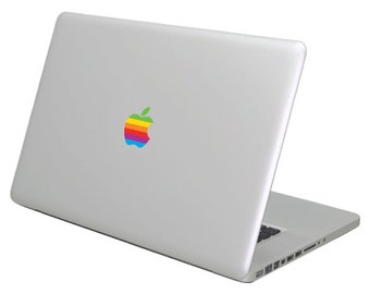
It shortly became apparent that this design actually mirrors that of the old Apple Macintosh logo. As a result it was felt that the design can be carried by this context alone. A design decision that was not intended but worked relevantly and effectively.

 |
| The black outline was removed, however it was still felt that the colours could blend into each other to modernise the design oncemore, and create a point of difference and progression from the original Apple one. |


 |
| The pixelation of the design when zoomed in creates an effect that mirrors the digital aesthetics of the programme (Ableton) itself, particularly the blocs that make up the structure of the software, and of musical volume in general. This was recorded as to justify the design decisions made thus far, as the imagery from the research also follow this visual. |
 |
| How the logo design would work on the front cover (to mirror the Apple Mac Laptops) |
 |
| After the design had been finalised, it was important to consider what stock could be used to best represent the intended concept. Accordingly, it was noted that holographic paper could both display the light spectrum of intended colours, and best mirror the 'lighting up' of the Apple logo when a laptop is opened. This also brings an interactive quality to the cover of the book, as well as a USP (unique selling point) that would more likely attract a consumer. This stock would be applied through foiling onto the cover card, that would be silver metallic card to mirror an Mac laptop oncemore. |
Although the initial typefaces explored had really relevant qualities that fitted well within the context of the book, such as the futuristic 'a' and tech-ish flow of 'Audiowave' and the almost new wave psychedelic characteristics of 'Squada One' that tie into the visual aesthetics of alternative music of the former (60s-90s – exemplified in the logotype for 'Yellow Submarine' below). It became apparent that the best way to visually communicate the concept of the book was through the minimal approach. After further experimentation, the approach became focused to a simple depiction that mirrored the visual literacy of AppleMac, and keeping this theme with the internal typeface as well, the simplicity and clarity would successfully communicate the intentions of the book.

No comments:
Post a Comment