'Morrison's poetic style is characterised by contrived ambiguity of meaning which serves to express subconscious thought and feeling.A tendency now generally associated with the postmodern or avant-garde. His poetic strength is that he creates poetry quite profound in its effect upon the reader, by using vividly evocative words and images in his poems.'
A Feast of Friends / The Severed Garden
Wow, I'm sick of doubt
Live in the light of certain
South
Cruel bindings
The servants have the power
Dog-men and their mean women
Pulling poor blankets over
Our sailors
I'm sick of dour faces
Staring at me from the TV
Tower, I want roses in
My garden bower; dig?
Royal babies, rubies
Must now replace aborted
Strangers in the mud
These mutants, blood-meal
For the plant that's plowed
They are waiting to take us into
The severed garden
Do you know how pale and wanton thrillful
Comes death on a strange hour
Unannounced, unplanned for
Like a scaring over-friendly guest you've
Brought to bed
Death makes angels of us all
And gives us wings
Where we had shoulders
Smooth as raven's
Claws
No more money, no more fancy dress
This other kingdom seems by far the best
Until it's other jaw reveals incest
And loose obedience to a vegetable law
I will not go
Prefer a Feast of Friends
To the Giant Family
Analysis:
"Sick of certain south, cruel bindings
the servants have the power"
This denotes a disdain for most concertgoers, most of society. He is sick of corporeal life, and throws in some Blakean imagery to let the reader know why he embraces death--which is what he's doing. He doesn't have any desire to convince anyone of anything aesthetically anymore as, to him, it produces very little result in the real world.
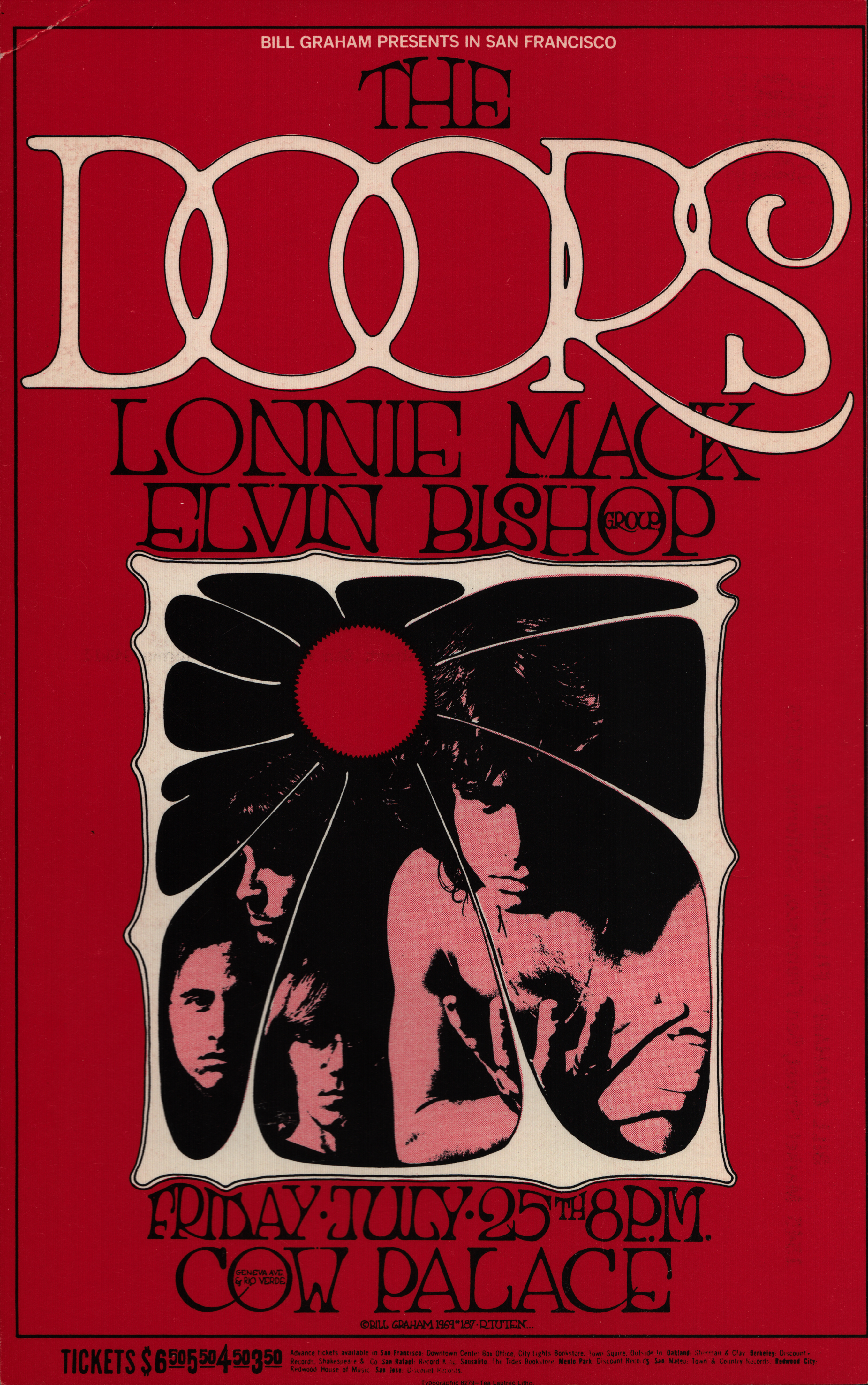
Visuals for The Doors

Concert Posters


.  .
. 
. Conclusions:
- A gig style 60/70s psychedelic aesthetic poster
- Fusion of type and imagery to express the poem
- Capture the transcendental nature of Morrison's ideas of welcoming death, and how corporate life has destroyed the natural world
- Since he died so young the irony of this poem stands out and adds value to its words
- As such the words should carry the design
- Reflect on the time period - add an element of nostalgia
Initial ideas:
The initial sketches looked at ways of replicating the 60s/70s psychedelic typographic techniques. Text and image had a tight association and it was important to get a feel for how this aesthetic was achieved.
Main characteristics included warping and following the folds of the former letter to create a word that is its own depiction. Additionally, lines are drawn to make a frame for the words, which can often prelude perspective and scale. For instance an eye shape drawn, would have small lettering at the beginning and end of the word and large in the middle. The shape is then taken away and the words compose the image itself. This is something that was experimented with in the initial stages.


I wanted to get comfortable with writing in this style, so trailed a few techniques before feeling comfortable enough to go onto the Wacom and start working digitally. This allowed me much manoeuvre with distorting techniques on Photoshop, to aid the development of the final design.

No comments:
Post a Comment