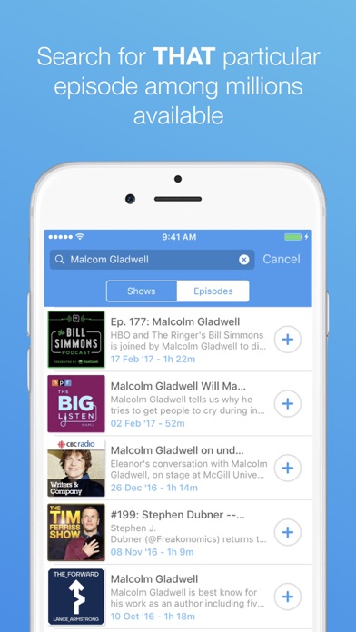
In response to a tutorial, the concept was changed from a podcast app as to
"respond and tailer briefs to your interests within design to ensure engagement within the modules".
Concept:
To create an immersive experience through the use of background screen visuals, in direct response to specific music to aid audience involvement. As such, this brief will explore the characteristics of live performance, and compose a narrative accordingly that responds to the message and emotions of the music, stimulating the audiences senses.
Before writing the concise brief, it is important to consider what type of music would react best to this concept. As such, research will be carried out into existing responses to music and visual performance with the use of screen.
Below is what to consider whilst looking at this type of research:
Project title:
Client name:
Budget:
Project overview: (project summary/ research sources & findings)
Project objective: (detailed goals/ desired outcomes)
Marketing guidelines: (existing branding standards)
Marketing materials: (website signage/ banners/ event/ display ads/ social media)
Target audience: (primary & secondary demographic)
Call to action: (desired reaction of TA)
Campaign look & feel: (desired style)
Message: (key benefit of the product/ its value)
Competitive analysis: (competitors - their message/ research/ findings)
Imagery: (graphics/ photography/ multimedia)
Initial secondary research:
Becky & Joe
They are innovative animators who use old-school basic manual methods to create vibrant and more current aesthetics. I really love the psychedelic nature of the music they choose, and how their animations directly respond to the emotions and pitch/tune of the music, as if someone was literally depicting the sounds.
Stop motion animation
1.Tame Impala 'Feels Like We Only Going Backwards' Music Video:
https://vimeo.com/53520224


2. Delicate Steve – 'Tallest Heights'
http://beckyandjoes.com/tallest-heights/
The animation is made from a combination of ink, paint, bleach, and scratching into different film sizes. The final images are high-resolution scans of super 8, 16, and 35mm film strips and acetate sheets.


3. 20syl – 'Back & Forth': Music Video
French director - Porthé
Motion graphics visual, more digitally based with strong characteristics that show it to be a direct response to the song itself. Use of instrumental imagery and flashing, as well as the aesthetically pleasing qualities of its symmetry (golden ratio etc).
Article: https://www.dezeen.com/2015/05/16/porthe-cubic-animation-20syl-music-video-micro-to-macro/4. Max Cooper – 'Order From Chaos' by Maxime Teresuac
https://www.youtube.com/watch?time_continue=50&v=_7wKjTf_RlI
Dynamic, colourful patterns represent the way organisms interact and evolve in the visuals for this music video. "The track uses a binaural sample of rain hitting my window, where the rain hits are obviously random, but I then force the hits towards a grid so that a pattern emerges from the raindrops based on their closest structure" (Cooper about his brief). Then using Houdini – a 3D animation program – he creates colourful dynamic visuals against a black backdrop meaning to represent "the beauty of life". "there is no story, everyone can imagine something" he told Dezeen, "it talks about emergence and tried to show the beauty of life, the birth of a simple plant from a seed."
This is a perfect example of how the visuals to a song can communicate the message of it as something personal to each viewer/ individual.
This is a perfect example of how the visuals to a song can communicate the message of it as something personal to each viewer/ individual.


Whereas these examples are for music videos, it is important to see how similar depictions work concurrently with live performance.
Primary Research
After visiting the 'Pink Floyd: Their Mortal Remains' exhibition at the V&A in London, it became apparent that certain musicians consider the entire physical experience of their music onto the audience, and how this can amplify both the story and emotions of their sound, as well as emitting their full intentions for the music to the audience. Pink Floyd are a perfect example of artists who seek to exploit an experience within their music. Their productions for 'The Wall' and "Us & Them' tours were of huge proportions, with a magnitude of creatives coming together to put on this show that projected their concept of the album to the audience - emitting their social and political views on the current society of the time.
- "I was struck by the thought that there was a huge wall, that you couldn't see, between me and the audience...Then I drew it and started to talk to people about it. And they thought I was mad, because my original idea was to start building a wall at the beginning of the show and, when it's finished, they can't see you or hear you any more, and then the show is over." - Rodger Waters
- The New York Times stated in its 2 March 1980 edition: "The Wall show remains a milestone in rock history though and there's no point in denying it. Never again will one be able to accept the technical clumsiness, distorted sound and meagre visuals of most arena rock concerts as inevitable." It concluded, "The Wall show will be the touchstone against which all future rock spectacles must be measured."


 (drawing board sketches and the real 3d structure used in the 80s tour).
Even the exhibition itself was advertised as an 'audio-visual journey' which a bluetooth headset that automatically links to the relevant sounds depending on where you stand. This in itself shows how technology, art, sound and graphics can combine to enhance a users experience.
https://www.youtube.com/watch?time_continue=6&v=x84y3M2MkgE


Other more contemporary examples of how background visuals impact a stage performance. In contrast to pre digital age, where most set design had to be hand constructed, now almost all performances use screens and digital effects to project onto the audience:
Lone; boiler room set, Moscow – examples of screen visuals used mixed media/ motion graphics/ 2d animation/ laser recordings etc.
Flume; performing live
(seen at Dour Festival, Belgium 2015)
He uses large scale imagery and epic lighting to entertain the viewer, creating a show that extends beyond the music.
MGMT; background visuals for their live performances
(Seen at Rock Werchter Festival, Belgium, 2014)Really 'trippy' psychedelic like animations with a mix of 3d and 2d stylistic effects
I remember specifically being drawn to their background screen, with the super vibrant colours emitting a warm feeling to the audiences.
 |
| The colours here are vibrant and enthusiastic, would definitely like to explore this aesthetic |
Primary Research: Leeds Light Night 2017
Dance performance in Trinity Church
used light projections of dances onto a mesh material as if to look like they were 3D and dancing in unison with the live dancers behind the mesh sheet. A very successful use of material and screen imagery to produce an immersive experience between performer and audience.


