Live Brief: The Salad Bar Concept A healthy, tasty and wholesome street food salad bar to go. Choose from a selection of pre-prepared salads for fixed price of £5. Each salad is vibrant, adventurous and filling made with fresh and locally sourced ingredients. Location would be the food market on Briggate Street (business district) or in Trinity Street Kitchen in the Trinity Centre. Target Consumer City people particularly younger professionals. Generally quite busy, looking for convenient and quick lunch option. Each street food regularly (at least once a week) so more conscious of the nutritional value. Brief All design should align with the healthy image of The Salad Bar company. Should be vibrant and recognisable so that the branding would stand out in a line of food stands. Require design for a logo (versatile enough to appear on clothing, boxes and social media), food stand banner, flyers (with a £1/20% discount). Budget £70-100 depending on number of features complete
Research
Existing salad shop logotype and imagery investigation
gaging a sense of the existing market


- Consistent use of greens
- green psychology: lively colour, symbolising renewal and growth, most naturally occurring colour, depicts aliveness, balance, calm harmony, colour of eco / environment
- Use green to state its place in the market, it seems to be a visual literacy for healthy / vegetarian / salad based businesses
- Leaves and vegetables - too conventional, steer clear, think same effect with different technique
- clean san-serif type
- colloquial, lots of handwriting styled fonts, to seem friendly and inviting
Location:
Briggate Street


Trinity Street Kitchen

T.A:
Young professionals
Rising trend of healthy eating (veganism / vegetarianism amongst younger generation)


Website and identity of main competition
- price range
- very dull colours
- needs more vibrancy, a lighter green, less corporate

Other branding ideas
 |
| This is a successful example of how the vibrancy of the food is reflected in the branding and visual identity. However the logotype itself is very basic and plain - as such it is accurate to conclude that the logotype and branding should be clean and simple so that when paired with the vibrant pictures it does not seem overpowering and chaotic. |


Initial Ideas
The initial ideas look at how the letters in the word can be manipulated to make a logotype that incorporates imagery simply within the type alone.


The design then went on to consider upper and lowercase, and what is best responsive to the vibe and goals of the business. The kerning and height of the text was also played around with to all extremes to see what each of these options resembled / communicated, and thus what it was that this design wanted to achieve from its typeface. It became clear that black would work best for the type due to its neutrality and ability to go with any colour if need be.
- Uppercase seemed too loud and intimidating for a salad bar
- Uppercase titles initially projected a good medium, however it also felt very official depending on the typeface
- The lowercase option varied starkly depending on the type choice, seeming particularly informal when not loosely kerned


 |
| Another initial idea was to look at how the letters looked in a box, to resemble the truck which the food is served out of. It was concluded from these experiments that the typeface should be light and thin as opposed to heavy and bold in order to reflect the produce. There is a sense of an aesthetic that resembles a active and healthy lifestyle of cleanliness and lightness that is best projected through lighter curvaceous text. There was however a nice concept behind the different shapes and sizes resembling an all inclusive audience, although in practice it looks more like a restaurant or coffee shop than a food truck, which is the identity. |
Imagery:
The purpose of the imagery was to have a logo that could stand alone for the identity of the business on, for instance, t-shirt design for employees and so on. But also to give complete transparency for the business, having a circular design that is symmetrical can concurrently resemble the salad ingredients themselves ad the wheel of the truck - which is the sole identity and USP of the business. This allows for a design that responds directly to encompassing all factors within its branding of practicality, aesthetic and concept.


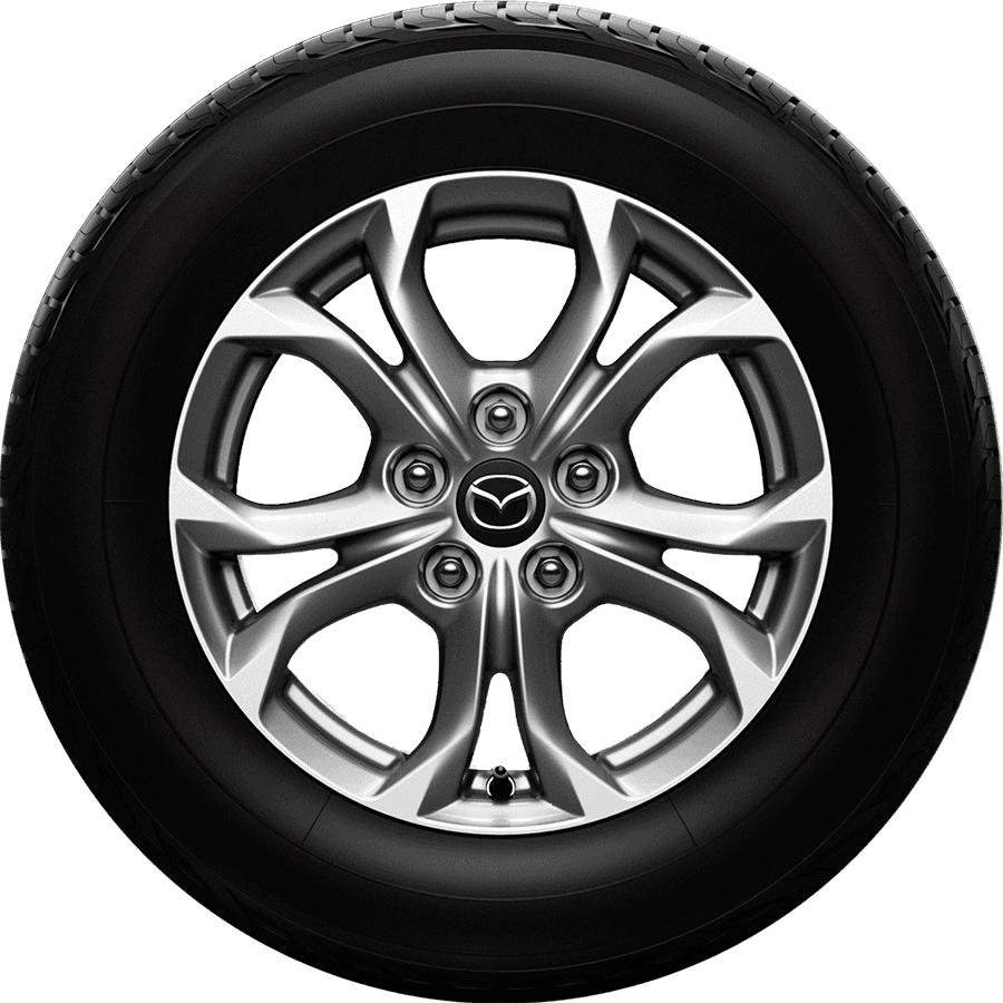


These simple yet detailed shapes were drawn on an app that kaleidoscopes your drawings (mirroring 4 times the line), allowing me to resemble the perfect geometry that appears both within the wheel and the produce. This represents the stability of its structure as well as the two aspects of the business proposal - salad from a van.
Design Development
The shapes were then vectorised in order to experiment with density, colour, opacity and outlines. The logo options were then places next to logotypes to see how they work together, and where they might work best placed. It was important to note with what typeface are the feelings of lightness, freshness and calamity achieved.


Typeface:
Bariol Regular was chosen as the final typeface for the logotype with a wide kerning of +50??
The typeface has soft curved edges that compliment the logo designs and carry on the circular motion. This is further complimented by the 'd' and 'b' not having a linear terminal. Its light and thin qualities are attractive to people desiring a healthy lifestyle.
Positioning:
Trying the different options of where the logo would work best with the type was important in maintaining a balance, as well as in order to best communicate the concept. The conclusion to place it on the left hand side was responsive to a peer critique, where the consensus was that this best exemplified the concept, keeping a clean read, resembling the wheel, and stating no hierarchy between logo and logotype, as they flow well when read in order.


 |
| Tighter kerning experiment fro comparison |
Business cards:
The idea to emboss for the business cards was to add an intricate aspect to the design that could be intimate for the customer. It is important for new businesses to add a USP and in this case, is the customer takes something away with them that is detailed and has texture they are more likely to hold onto it, giving it a memorable quality.
The logo and the logotype are consistent however not bound, the design's qualities are such that is allows space for manoeuvres. The shape is really beautiful and intricate and so embossing it on fibre paper gives it this authentic feel, as if its from a previous time, whilst the type brings it back to modernity. This juxtaposition works well in evolving the branding further than just a printed banner.


This was chosen to be the final business card design as the green keeps the psychology of balance and nature (natural ingredients / healthy produce connotations), whilst blending with the logo, intertwining and working in unison. The black type seems too far in front of the shape, and loses its obvious link to a healthy food chain, seeming more cold and bland. The type clashes with the image instead of complimenting it.


The client also wanted to add some vibrancy that reflects the colours in the salad. It was decided this could be best through the t-shirts worn by staff. After presenting the mock ups in coherency with the entire branding it was decided that sticking to white, green and black best reflects the professional side of the business, and if anything highlights the vibrancy of the produce.
Within advertising and extras is when it is important to be bright and bold, however for this side of the fundamental branding, it was more pivitol to have a consistent brand and logotype/design that won't clash or jar, and could be used easily on banners, packaging, clothing, business cards, flyers and so on.


Motion graphic:
I wanted to evolve from the basic fade in intro, as I got more comfortable with video timeline on Photoshop. As such, I thought imitating the wheel with the logo like a truck pulling up and reversing would be a great snippet to share online for the identity of The Salad Bar. It's clear and simple goals are successful in communicating the concept.

Logo and logotype

Business card
Motion Graphic for web use
Menu design

Employee t-shirts
Evaluation
The logo is extremely representative of its purpose. Its simple geometric design resembles both salad produce (lettuce, cabbage etc), as well as the wheel of a truck / automobile which is the identity of the company. The green relates to the eco and environmental side of the company, and the healthy living aspect of eating clean with its produce. The logotype that accompanies this design is friendly and simple. It's lowercase nature makes it not intimidating to the customer, and its curved edges flow well concurrently to the spherical design. The malleability of the two working together allows a lot of space for the brand to evolve, with sometimes solely the logo representing the entire brand.