Secondary research into the book market - stock / aesthetic / form / characteristics
Visiting Professional: Ben Holmes - Village

Visiting Professional: Ben Holmes - Village
How you design has the ability to perceive how people view that book.
Background of Village book store:
- started in the corn exchange
- 5th birthday
- small shop where people could come and engage from around the world
- bring stuff from outside the city into the city - great artist and publishers - New York / Tokyo
- provide a space where people can get exposure for what they're doing on a playing field - compete with london etc - expand the creative community in leeds and keep young creatives from moving further afield
- non-profit gallery space to be used
- collaboration with the artists exhibiting - opportunity to showcase and for people to get exposure with their art

evolved beyond small and staple publication - independently published
why self-publish? - internet age where so easy to get your work seen by lots of people, where they're also seeing lots of other work at the same time - a zine slows people down, a lot more personal and specific - seeing/ touching/ smelling - entirely focused on that persons creative output - creative something permanent
Melbourne design studio - made - produce an annual publication to showcase what they do as designers but also to do something they're interested in
folch studios - Barcelona
whack magazine - New York
communicating their ideology to people
bi-annual magazine featuring a range of artists/ designers/ photographers - brief interviews - standard - great opportunity to collaborate
What they look for:
- the concept - more than images and text - should have a purpose - under-arching idea
- format - potential to communicate a lot about the book
- Fire in Cairo - Matthew - design and layout says a lot about the book - arab spring revolution - zooming in the situation - increasing your clarity - goes from 50% of page to full bleed image - mirrors this idea
- how the book is printed - screen printed / purpose - decay through repetition -
- 'this is the same ocean' zine plays around with print techniques, manipulating image and content - printed different ways as it goes through
- Surface phenomena - entire book is photographs of same spot in the Australian oceans, everyday for 18 months - has matte tactile paper running through and every now and then some gloss paper that makes the colour pop off - juxtaposition creates a rippling effect / some pages are portrait and some are landscape - idea of hypnosis as you look at the ocean and lose sense of convention
- the details - spot varnishing / foiling / little finishes & touches - has to suit what you're trying to say
- 'some windy trees'
 |
Fire in Cairo 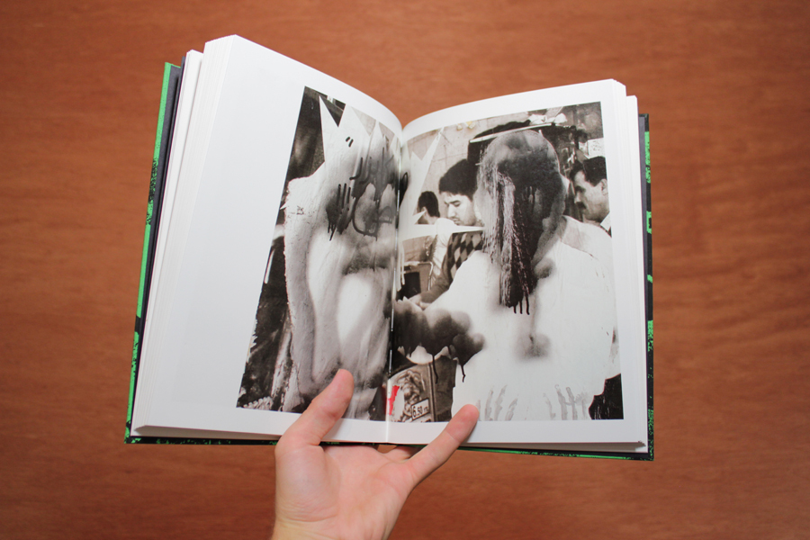 |
 |
| Surface phenomena |
Concluding information:
- get involved in the self publishing community - off-print in London
- First zine they published - Christopher Nunn - Ukrainian Street Dogs - photos of stray dogs at night - every copy of the book came with a cigarette card - little low cost touches can enhance the book as a product
- tripod city - 3 photographers from London - different styles come together to tell a story from different perspectives - photos taken from Ghana -challenging peoples preconceptions of what Ghana is as a country - communicate the vibrancy - bruce usher - gold dust - made own typeface
 |
| Tripod City |
 |
| Back cover Tripod City own typeface created for the book |
Primary research into the book market - stock / aesthetic / form / characteristics
White Cube Gallery: Bermondsey, London
Going to the book shop of an acknowledged art institute allows for a perception of a wide range of credible informative and artistic content. The wide selection the book shop holds covers many different stocks and layout design solutions that work to form the final publications. The variations in size and content depends on the purpose of the book. More photography based publications had either glossy thick paper or a more textured fine stock (depending on wether it was apart of a large full book or small specialised one). Layout varied from double spreads to small sections of the page, to more randomised placing, yet keeping a constant clean composition.
Getting a physical feel of the books, and looking at the varying binds allows the designer to understand the process and purpose of the book. Is it meant to be long-lasting / sustainable, or more delicate and visual.
The way the book looks on a shelf is also important. What is its USP (unique selling point)? How does it look in a stack? Important to think of the context the book will be in, and what can attract the customer. How can it inform people off the bat that this is a book on music - this is already capturing a collective of people who recognise and are interesting in music and thus this book could be of interest to them - attracting them to the product due to the design decisions of the spine / considerations of the book in context.


Outcome: Idea for Spine

Final designs:


How it looked on different stock:


How it looked on different stock:


 |
| Different weights to test how the clarity would look |
No comments:
Post a Comment