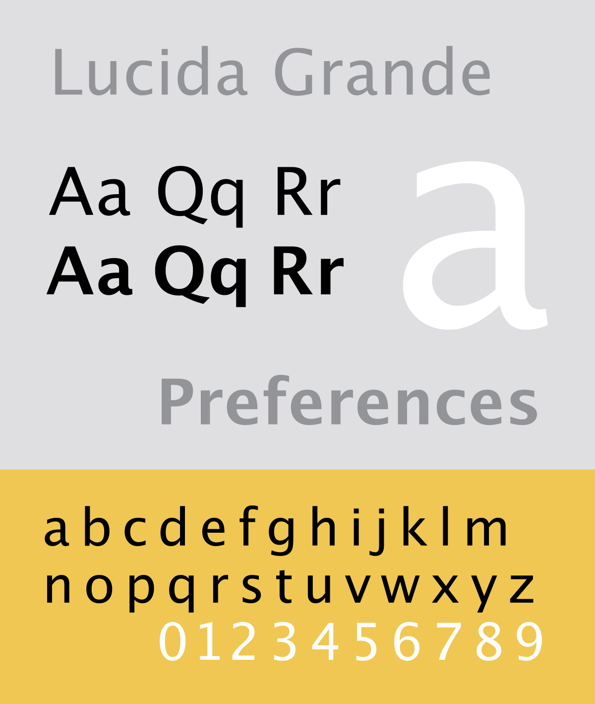
The benefits of keeping Lucida Grande as the sole typeface throughout the publication include:
- Keeping consistency with the aesthetic
- It is very clean, modern and easy to read
- It has proven itself to compliment a clear white background (as on all apple products)
- Due to the overall 'Mac laptop' aesthetic, this typeface will place the text into a context, making it more engaging. Any other typeface could confuse the reader as to the books intensions.
 |
| Exemplar page: the book opens upwards from a landscape view, with each top page reflecting that of the computer screen, with the black border, and the bottom page being the keyboard with the relevant text fit within a tight border. |
Qualities of the book:
The publication is such that is needs to be able to open to a spread and remain open. This is so that the viewer can be on their computer/ laptop and simply look down to the relevant spread to guide them through the process, without fiddling. This was an important aspect of the design to consider in relation to the ease and functionality of the design for its purpose. Resultantly it would be down the the binding of the book to produce an appropriate outcome. The coptic stitch book binding method is one that allows a book to open 360° without damaging the pages.
Functionality-wise Coptic binding doesn't use any particular glues, and results in a book that can open flat. The covers can be made out of anything and allows for gap between the front and back that can be used to incorporate a spinal feature after (which is useful for this design's spine idea of a music sheet — see below).

In order for the Coptic stitch to be applicable, the book is to be printed in signatures. If each page is printed double sides, then 4 pages will exist on a single printed sheet. In a book of 24 pages (as must be a multiple of 4 to work), this will result in 12 sheets, however double sided print — which is required — will result in 6 sheets of paper being needed to print the overall book, reducing costs and efficiency. Each of the 6 sheets will be their own signature, thus resulting in 6 signatures for the overall bind of the book.
Stock choices
As the cover of the book is to resemble a Mac laptop, it was important to consider what stock would both look the part, and be practical in the production, distribution and application of the book.
The choice was between slates of aluminium and metallic silver card, as well as other thin metal scraps for the spine. They varied in shininess, reflective qualities and cleanliness. Each piece was placed next to an apple Mac to see which one resembled the laptop aesthetically.


The single slate of aluminium had the right matte sheen to it, in comparison with the metallic card that is very reflective and shiny. However, although by using scraps the costs remains low (in this small scale sense - free), the aluminium sheet is heavy and sharp. In practicality terms, this defeats the point of a light weight and easily transportable guide book. Thus the design decision now became a choice of practicality over aesthetics. The metallic card is stern and relatable for a book cover, it also is the only material here that could be embossed, although the others could still be foiled.
Accordingly it was concluded to use the silver metallic card, so that the appropriate finishes could be applied, and the book could remain a casual and light pocket guide.
No comments:
Post a Comment