In order for the client to invest in the project, they need to have an idea of how the visuals would look on stage, and how they could be used to enhance the performance and overall user (audience) experience with the interaction between performer and their crowd.
The positioning of the band, the size shape and direction of the screen, as well as where the crowd will stand is all important to consider, for the overall effect to be successful.
https://vimeo.com/104522802 - Anna Ginsburg talking about her work for Bombay Bicycle Club tour visuals, and looking at how the design fitted into the circular screens that were used for their screen based identity and user experience.
Looking at existing stage design, and how my design would work in different situations:


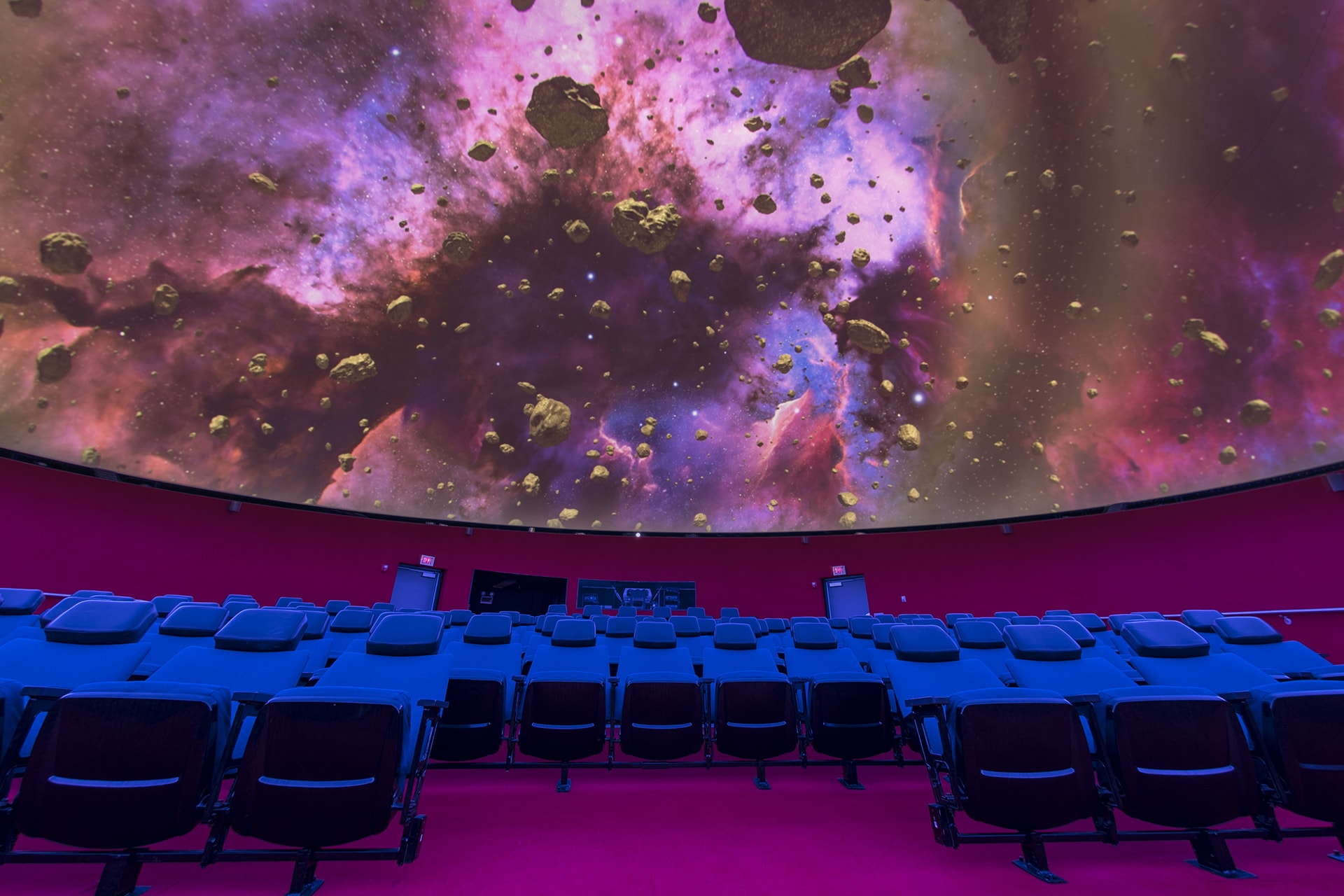
The images above fuelled the design development of how can the stage and lights be used to further enhance the user experience. The idea of a planetarium ceiling arose. This could be achieved using black felt with LED lights, or hanging glow in the dark stars on clear string. However if this process is long and expensive, simply a light projection could be projected onto a solid coloured ceiling. This is low-budget yet could enable a transcendental immersive environment - which is surreal and the objective of the psychedelia music genre.


Designing the stage
Developing on from the initial wireframe stage, with all the new information and productions in place, it was important to adjust the stage design to best fit the screen based designs.
Before the design couldn't be visualised that much, but gaging the various angles of viewing the stage, and how the present designs will look in context should help exemplify to the client how it will appear.
 |
| The initial stage design from left and right perspective of the stave, and from above |
Sketches for adjustments
With the designs having a lot of varied portrait and landscape imagery, as well as with influence from Bombay Bicycle Club's circular screens, there was a design decision to manipulate the screens to best fit the current media. Having screens change on and off depending on the imagery could amplify the visual experience, as is often seen in art installations. It becomes guided and solves the problem of not having to adjust the present imagery. This shows how screen and design can work together in presenting the final goal more successfully.
 |
| Vectorised images |
 |
| Possible background |
Mock ups // context
 |
| Band structure (can be manipulated position wise) |


No comments:
Post a Comment