Garamond:

- Old-style serif typeface
- Designed by Parisian Claude Garamond in the sixteenth century
- Distinctive characteristics include a small eye of the 'e' and a teardrop shaped bowl pointing to the top left of the 'a'
- Low x-height
- Often used printing body texts and books
Caslon:
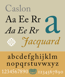
- Old-style serif typeface
- Designed by William Caslon from London in the 1700s
- Organic structure resembling handwriting with a pen
- In its italic form, the letters slant varies, with the 'A' being particularly slanted
- Has short ascenders and descenders
Baskerville:

- Traditional serif typeface
- Designed by John Baskerville from Birmingham in 1757
- Increased contrast between thick and thin strokes, sharper serifs that become more narrow
- Curved strokes are more circular in shape
- Popular in book design
- Doesn't exist in bold
Bodoni:

- Didone or modern serif typeface
- Designed by Giambattista Bodoni in the late eighteenth century
- High contrast between thick and thin lines, similar to Baskerville
- Condensed structure and geometric construction
- Flat, unbracketed serifs
- New designs and not reconstructions/ updated versions of Roman and Renaissance letter styles
- Vignelli stated that "Bodoni is one of the most elegant typefaces ever designed"
Clarendon:
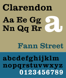
- Slab-serif typeface
- Designed by Robert Besley from London published in 1845
- First registered typeface
- Extremely popular in certain parts of the world, particularly for display applications e.g. posters - commonly associated with wanted posters of the American Old West
- Thick with straight serifs
Berthold:

- The H. Berthold type foundry, renowed for crafting high-quality typefaces, was founded in 1858 by Hermann Berthold in Berlin
- Akzidenz-Grotesk is a sans-serif, grotesque typeface
- Designed in 1896
- Akzidenz, meaning 'trade', was designed for commercial use - publicity materials, adverts, tickets
- Characteristics include a square dot over the letter 'i', double story 'a' and narrow apertures and strokes curled up towards the vertical
Times:

- Transitional/ old-style serif typeface
- Commissioned by the British newspaper The Times in 1931 and created by Victor Lardent
- Very common in books and general printing
- Standard computer font for Microsoft, made it one of the most commonly used typefaces in history
- Has a resilient and solid design, returning to traditions of printing from the 18th century
- Influenced French, Dutch and Belgian early modern Baroque printing
- Solid structure and clarity
- Slightly condensed, short ascenders and descenders, high x-heigh
Helvetica:

- Neo-grotesque/ realist san-serif typeface
- Designed by Swiss typeface designer Max Miedinger in 1957
- One of the most popular typefaces of the 20th century
- Termination of all strokes on horizontal or vertical lines
- Unusually tight letter spacing which makes it look very dense
- Neutral typeface with great clarity - used for wide variety of signage
- Tall x-height making it easier to read in small sizes from distance
Univers:

- Neo-grotesque san-serif typeface
- Designed by Swiss, Adrian Frutiger, in 1954
- Notable for being available in a range of weights and styles
- Seen in the Swiss style of graphic design
- Slanted form oblique
- Frutiger describes it; 'visual sensitivity between thick and thin' strokes, avoiding perfect geometry
No comments:
Post a Comment