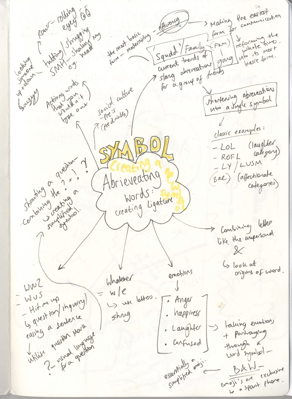
 My partner and I started off by researching modern slang
terminology amongst youths over social media, as well as current trends, with
the intention of abbreviating a word into a single symbol that can be added to
a keyboard. We wanted to enable efficiency and ease of communication, through
refining and problem solving.
My partner and I started off by researching modern slang
terminology amongst youths over social media, as well as current trends, with
the intention of abbreviating a word into a single symbol that can be added to
a keyboard. We wanted to enable efficiency and ease of communication, through
refining and problem solving.We wanted to further explore some ideas, to see how far they could go and if they were successful before fully indulging in that given path. We started off with ‘action words’ in the form of ‘spudding’ or ‘high fiving’, which led us down a more picturesque path, which we found to have a lack of multiple options - so we moved on.
 |
| Our original symbol was inspired by the negative space pattern created when two people touch knuckles. We then curved it round in a sort of ying yang style, resembling that symbol which traditionally signifies friendship.‘Shouting a question’ we then expanded on our idea of abbreviating a question in communication, with the intention of speeding up the transfer of information. Sayings like ‘what you up to’ or ’what you saying’ in modern day exchange are the norm. |

My partner then spoke of the unique emotion that transpires
through the combination of an exclamation and question mark – that sort of
excitement or shout within a question (maybe confusion?). As such, we first wanted to combine them, and
then go on to incorporate the sayings within this symbol. This investigation
was cut short when we found the ‘interrobang’ already existed.
‘squad’
through research and context we discovered the roots of the
now evolved slang work for a group of friends, back to ‘square’.
We first experimented with ligature by using the shapes of
the letters involved, to try and configure an appropriate composition. As well as symbols in coherence with our previous spud attempt, placed inside a square this time.


None seemed to be too successful, and we settled on choosing
more abstract/ambiguous roots to find our symbol, with the intention of
developing a character that could be useable in all fonts that is not a logo.
 |
| One variation that was less successful however explored and covered the various possibilities in line with the theory and idea |
 |
| Finalised idea Using the properties of the square, we used the idea of four equal sides to experiment with creating the S letter, with san-serif qualities, establishing the anatomy of the design. |


We wanted to take the symbol into practical context, by
establishing a hand sign, whereby you see the transitions of the square into the ‘s’. We
then touched on how this sign could be used by people in pictures to represent
their friendship ‘squad’.
No comments:
Post a Comment