
The history and 5 distinct qualities of Helvetica, outlined within the film:
Helvetica is summarised within the film as being “timeless”,
“universal” and somewhat “unfixable”.
Swiss:
The typeface Helvetica is praised for its legibility,
clarity and applicable qualities. Rick Poynor notes ‘the social responsibility’
of designers, and with the ideals of design seeking to rebuild and
re-construct, and be more democratic to the eyes people, the emergence of the
international typographic style – driven by Swiss designers – enables this
sense of idealism through the use of Helvetica in anything from sign systems to
corporate companies. Originally called Die Neue
Haas Grotesk, marketers
wanted to make it sellable in the USA thus calling it Helvetica coming from the
Latin origins meaning ‘the Swiss typeface’.
Context:
Helvetica was considered to be a real step from the traditional
1950s typeface. Its unclear exactly how it came to be, however they wanted to
modernise a san-serif German font. Doing away with manual details, it was noted
as a more neutral design. Its neutralism
was relevant in the sense that a type shouldn’t have a meaning in itself, as
that is in the context of the text not the typeface, which is essentially why
designers liked it so much.
Construction of
Helvetica:
Mike Parker: “When
you talk about the design of Haas Neue Grotesk or Helvetic, what it's all about
is the interrelationship of the negative shape, the figure-ground relationship,
the shapes between characters and within characters, with the black, if you
like, with the inked surface. And the Swiss pay more attention to the
background, so that the counters and the space between characters just hold the
letters. I mean you can't imagine anything moving; it is so firm. It not a
letter that bent to shape; it's a letter that lives in a powerful matrix of
surrounding space. It's... oh, it's brilliant when it's done well”
It’s characteristics included
horizontal terminals/slicing off, which was praised, as it “seemed to be
exactly right”.
Timeless:
Much of its timeless qualities are linked to its efficiency
and neutrality. Corporate rebranding suddenly looked a lot newer and cleaner.
After Helvetica everything was simplified, magazines were reduced to straight
to the point depictions, and this sense of modernity came about. When released
it was exactly what designers were looking for. Helvetica “seems human”, which
is what made it so fittings. It has been
described as ‘transparent, accountable and accessible’; with its lack of
contrast it becomes a default that brings a style with it, thereby producing a
look of reliability, which is desirable for a business. The san-serif, horizontal
terminals have been described as offering a feeling of finality, it is conveyed
as unfixable; stating “everything after it was secondary in some way”.
Ubiquity and
negatives:
The documentary undeniably emphasises the pervasiveness of
Helvetica, so much so that some designers commented on Helvetica being its own
brand, questioning the extent of personality that can be carried through form
it. However, whilst many to praise the
typeface, post-modernism seemed to reject it, talking about corporate culture
and moral reasoning as lots of the main companies using Helvetica sponsored the
Vietnam war. Manuel Krebs and Dimitri
Bruni expressed it as being overused and over-associated, thus losing its
capacity to look nice. Erik Epiekermann critiques the font in a different way,
saying, “its like an army not individuals as all the letters look the same”,
whereas we are human and different. These ideas touch on the globalised and
capitalist and socialist qualities the font has, whilst contrasting it to
modernism.
Nonetheless, Neville Brody expands on Helvetica
as marking safety, conformity, neutrality, efficiency and rationality,
amplifying why it is seen everywhere.Brands using Helvetica in their logos:
1. American Airlines (and the rebrand)
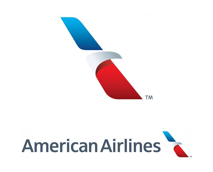
When asked about what he was trying to achiever with the original design, and his reaction to the news of a new design, Vignelli responded;
"Legibility, which is a very important element of an airplane. So we used Helvetica, which was brand new at the time. And we wanted to make one word of American Airlines, half red and half blue. What could be more American than that? And there were no other logos then that were two colours of the same word. We took the space away, made one word, and split it again by colour. It looked great. The typeface was great. We proceeded by logic, not emotion. Not trends and fashions."
"There was no need to change. It’s been around for 45 years. Every other airline has changed its logo many times, and every time was worse than the previous one...It’s ridiculous. A word is so much better."
Here we see the timelessness qualities of Helvetica being put into practice. It's characteristics of clarity and legibility made the typeface relevant and applicable to an airline brand, as the type would need to be bold and seen from a distance. Thus, when applying these techniques to my work, my designs will consider clarity and applicability to a higher degree, considering relevant colouring to enable a successful brand.
2. The North Face
The North Face is an American outdoor product company founded in 1966 and is one of the biggest climbing equipment retail stores. The tight kerning and capital use of Helvetica, makes the logo both bold and simplistic. The mixture of straight and curved lines within the type, imitate the action of walking/hiking in terms of the motions and variety of paths. The logo also incorporates the use of vibrant colour (red) and the text aligned to the right side to complete its overall effect. As such the use of Helvetica definitely contributes to it's success as a brand.
3. Microsoft
No comments:
Post a Comment