Chosen font:
| Above shows the lower case Bodoni regular font. I chose lower case specifically as it has a mixture of curved and straight lines, which can offer varying pattern opportunities, and is more malleable. |
 |
| A type specimen for Bodoni |
I chose Bodoni due to its thin and elegant structural anatomy. The idea is to take the simplistic and traditional font, and add swash characteristics, essentially using Bodoni as a canvas for development.
Designed in the late eighteenth century, the font is ideal for connotations of the gothic sublime and literature and creative arts in Britain at the time. This includes the fine artists too, who heavily explored 'The Sublime' due to its implications of 'greater than humanity' and the elitism of art in that time.
Bodoni's high contrast between thick and thin lines provide the elegance that Vignelli praises so much. It's flat, unbracketed serifs serve as a firm construction base for its combination of fragile and bold lines. They allow the font to seem as if it completely sits on a line, and this is something I would like to amend. Additionally, Bodoni has relevant features which contribute to the selection of this font for my design. The spine of the S is a clean and carry's a weight that is balanced out either side, and the same stile is evident in the shoulder of the 'h' 'm' and 'n', which can serve well when considering adding curves and swirls to the end.
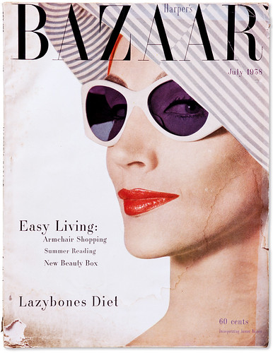
Bodoni in context:
The images below show commercial representations of where Bodoni has been used in context. All the examples depict a clear elegance and fragility (connoting worth) to the font that may add to it being seen as classy (through high-end branding). It thus presents itself as being a great canvas for the word sublime, being synonymous with majestic and aesthetic.


First attempt of possible typeface pathways


No comments:
Post a Comment