


My research into soap film:


Photographer Kim Pimmel uses soap, water and food dyes to recreate this effect in a much more simplistic and minimal way for the music video 'Jack and the Giant' for A Love Like Pi. The idea of an unstable bubble that could burst at any point, allows for freedom of the material to produce the art itself, focusing on flow and science for the varying densities and concentrations of liquids to either merge or flow in harmony.


Translating research into practical:
Similar to these techniques, at an arts festival in summer I experimented with using soap, water, oil and food dyes to create similar patterns that then used light to upscale and enhance the pattern, making it less dense and compact, and thus more minimal like Pimmel's work. However, unlike with film, the light was an outside source that I added in through projection.


This gave me the idea to create some smaller scale sink prints, which could then be used in publications somehow - whether that be wallpaper, album art, coasters or posters and so on.
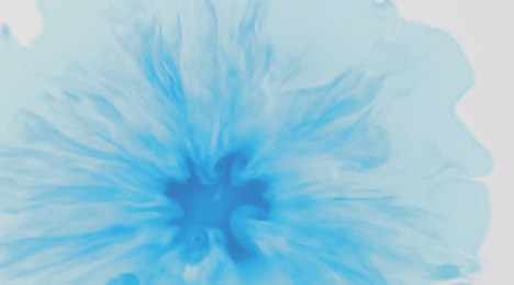
As such, using the materials of ink, liquid soap, soap wax and water, I created a series of sink prints that explored the aesthetic this could create.


I then edited these to explore a series of techniques that could be used. Did I want to explore warm or cold colours and what message did the colour of the print give?


I first inverted the original print to see how opposite colours would effect the tone and mood of the image, it seemed to create a far more emotive piece which is almost explosive. The other more colour edit uses intense saturation and high distortions on curves and exposure. I wanted to see how a messy, unorganised composition bursting with colour and energy would look, mirroring the soap film experiments and taking away Pimmel's minimal approach.


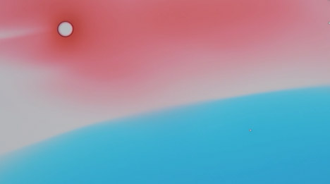
It was important to see how the image looks in monochrome, in order get a feel for the tone of the piece - where does light and dark work best, and how intense should the contrast be. As a result, I am able to distinguish that the multicoloured one lacks distinction and thus depth and understanding. Additionally, I wanted to see how complementary colours worked from both tonal perspectives and so edited this green and red variation, and how thus the negatives could complement each other.
Next composition edits:


These edits focus on warm vs cold and how different emotions are emitting depending on each. E.g. blue is more related to the water and its calm and relaxing associations, whereas red is danger, passion and unnerving.
Next composition edits:


The inverted series establishes the contrast between light and dark, enabling a more intriguing production, where the pieces can become a series rather than standing alone, accentuating different parts of the print in each. Thus, being placed as a pair offers variation and a different emphasis.
Adding greater tone through highlighting areas and accentuating hidden tonal shades in the background, allows fore more colours to be applied to the edit. These two focus on just a section and more intense exposure, reducing the subtlety in merging shades.
 |
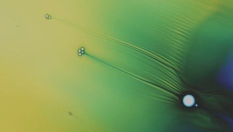
These two versions look almost like bacteria under a telescope, which enables an interesting juxtaposition between the aesthetic and the source of production, with the irony of soap being intended to get rid of bacteria. 

No comments:
Post a Comment