The project looked into how an invitation to the event could best be produced. Designing an invitation for the banquet adds a deeper element to the overall concept, enhancing its realistic attributes. It is also a great way to explore type of different eras and see how typography can be manipulated into communicating period nostalgia.
The process looked into informed ways to structure the end invitation design, as if it was produced for the time of the banquet itself. As such layout, form, colour and type design decisions were investigated to best translate an accurate outcome.
Context:
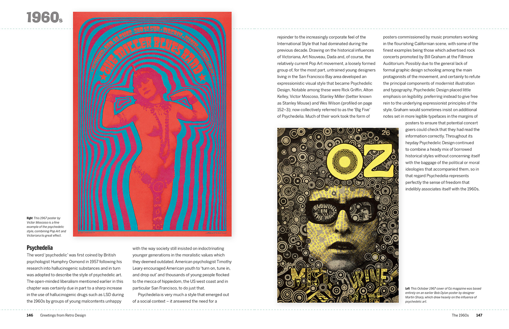
Looking into a more 60s psychedelic aesthetic to see how traditional art deco designs can be combined or interpreted best in line with the designs rationale (formal vs informal / old vs new). This aesthetic follow a more curvature form.
Imagery:
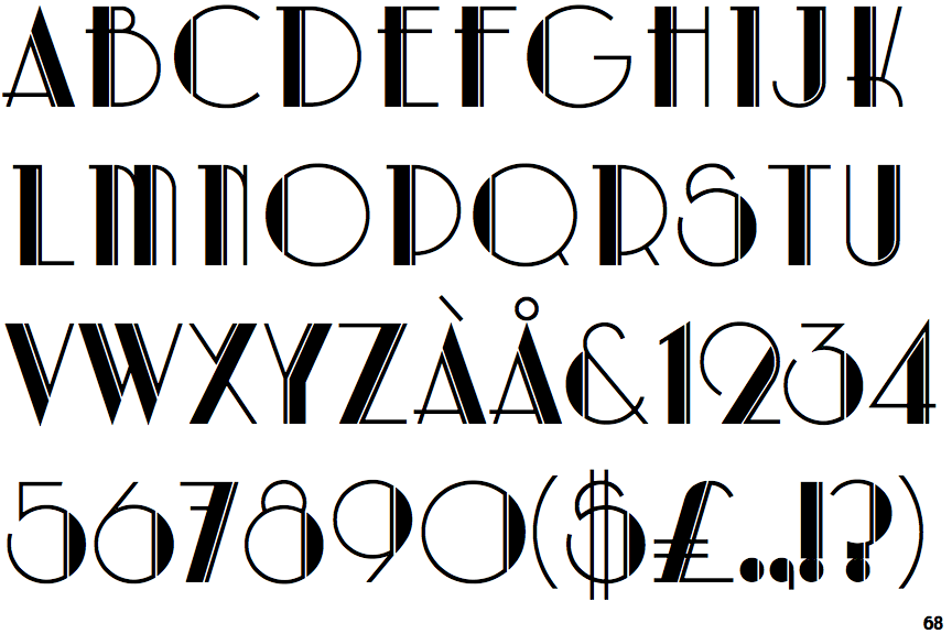
The imagery for the 30s era is very melodical and elegant. It's minimal art deco aesthetic featured curving forms and smooth, polished surfaces. Art Deco is one of the first truly international styles, but its dominance ended with the beginning of World War II and the rise of the strictly functional and unadorned styles of modernism and the International Style of architecture that followed.
As such, the designs are minimal yet detailed - repetitive forms / focus on linear flair.


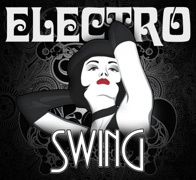
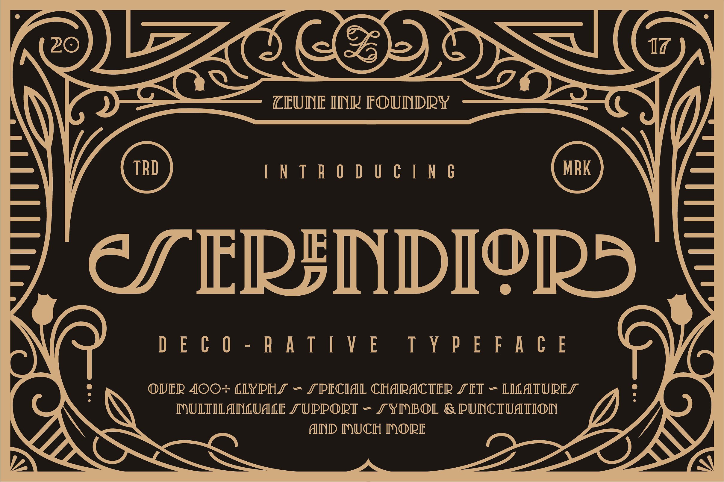
The typographic choices associated with electro swing graphic design combines old and new in this way. As such using two typefaces could present well the various connotations behind this micro-genre. I especially like the finishes on the more traditional typefaces which give an authentic flair.
- san serif vs serif
- psychedelic vs deco
- formal vs informal

Art Deco:
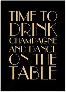
Art deco designs have distinct characteristics - tall & thin, unevenly weighted, extra finishes on certain letters - the aesthetic is distinct and recognisably connected to this era.


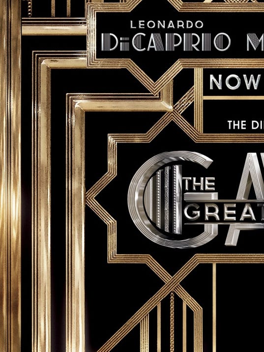
The Great Gatsby:
Baz Lerman's 2013 interpretation of 'The Great Gatsby' is an ideal case study for the production of 1920s/30s art deco design. The typographic choices as well as additional structured linear bordering completes a visual literacy for the era.
Existing invitation interpretations:
Black and white stripes / check further aids the link to Alice in Wonderland and Dali aesthetic, combining the two visualisations into one informed and characterised production. The lines here also compare well to that in the psychedelic investigation, however these are more loose and flowing, yet still repetitive in nature (modernism vs post-modernism?).


Conclusions:
- Colour - black & gold
- Bloc, thin
- wide kerning
- combine more psychedelic modern type with art deco
Primary Research:
I managed to get hold of a wedding invitation from the 1950s. This allowed me to get more informed and accurate translations of the wording and typographic choices of an older period, as well as the formalities which would have been considered. This allowed the text itself and hierarchy of layout to be more informed and realistic for the overall production.


I managed to get hold of a wedding invitation from the 1950s. This allowed me to get more informed and accurate translations of the wording and typographic choices of an older period, as well as the formalities which would have been considered. This allowed the text itself and hierarchy of layout to be more informed and realistic for the overall production.


Designing the Invitation - border and type experimentation
The initial ideas focused on the border, and what sort of style of art deco the invitation looked to achieve. It wanted to resemble a more upper class / noble characters and so this was considered when exploring the various options. The design sought to make the design as minimal as possible yet retaining the necessary finishes to best translate the contextual and visual findings.
More rigid art deco designs were compared against a more traditionally considered design in order to find a healthy balance between the two that is minimal yet 'royal'. A wealthy family of the time would've sought to be presented as formally as possible, and so this was considered.
The end result combined various successful characteristics from the different experimentation into one final output that adheres to the design's goals.


More psychedelic type experiments were explored for a possible front cover vs back cover to the invite. This used traditional 60s typefaces and warped them to add movement through ideals of melting and breathing, to communicate the hallucinogenic qualities of moonshine. As the digital print resources were restricted, this was left as a concept. Although relevant to the design, over-complicating the invite may have taken away from the accompanying imagery, and thus the simplified outcome is more practical for the designs purpose.


Translating the design into black and gold was what really brought it into the relevant context - adding the final element of pastiche. This allowed the design to progress in a way that was more representative of the prior investigation.
The borders explored more intense and classic imagery against more minimal approaches.


 |
| If time screen printing was considered for production and thus this template on a gold metallic paper |

Various layouts for the type were played around with, trying to take away as much excess as possible. The final layout seeks to be as central and ambiguous as possible, providing the necessities of a date, location and r.s.v.p. (which was used in this time). The address was taken from the area where the Great Gatsby was set in order to enhance the accuracy and credibility of the production.
Peer Critique:
These three outcomes were presented to a group to gain an informed consensus on which was most successful and appropriate for its purpose.


The final design was chosen as it acknowledges hierarchy and typography choices in relation to the desired context. The border is minimal yet includes extra finishes that add the stereotypical visual literacy for old-fashioned aristocratic design. The type combines art deco headers with more scripted type to compliment the bordering designs.
Print:
The printed outcome was not foiled in gold as the resources to do so would impend its overall quality and aesthetic. Nonetheless it displays well the colouring of art deco, and the gold does not come across musty as is the case sometimes when its not metallic.

No comments:
Post a Comment