The captioned text was added on using After Effects, carefully editing the design so that it was as responsive to the audio as possible, to maintain a healthy flow.
White was chosen to colour the captioned type, to contrast with the black background as a neutral choice, that doesn't wouldn't over-saturate the screen and jar with the colourful imagery. Using white also meant that the type could remain consistent without clashing with the varying coloured imagery.


 |
| note the page looks like this as the files were moved since exporting |
Section Two
It was difficult to find the relevant section of audio from the Avatar show to accompany the first section, as most videos already had music in the background, which did not flow with the former part. As such the design decided to find the episode with the relevant dialogue, download it and extract the audio.
The audio was then cropped down and the accompanying visuals were distorted using the effects in After Effects to mirror what the monologue said.
i.e.
- 'ridgid and stale' was translated through a loss of colour and form
- 'others' is depicted through a magnetic retraction between the shape, with its layers unfolding created RGB colour fragments
- 'help you become whole' fuses the repelling back to one contained shape
In order to save time and to show more in-depth the original animations, the element visualisations were used again in sequence for the second section. The design then took the depiction of all the 4 elements as one, and distorted that relevantly to depict the final scene.


The final outro used a ying-yang as a universally understood and recognised symbol of balance, rotating to clearly visually represent this.

Version one: https://youtu.be/u17hFb0pWdM
After peer-critique reforming:
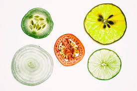
The first output of the first video seemed a bit too repetitive with the use of the same image for 'the ways of taking in energy', which seemed lazy and out of sync with the quick transitions of the former. As such the design researched ways of presenting 'food' and 'prana' to for the refinement of the first render.
It also found the colour of the introduction's type to be somewhat 'tacky'. Initially the turquoise RGB blue was chosen to reflect the LED vibe of the imagery, but after feedback it was decided a faded white would work better with the rest of the text, and strip the already saturated video back a step to a more easily transferrable visual literacy.
Food:


Prana: 


Outcomes:
Prana


No comments:
Post a Comment