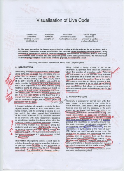
Understanding computer and Artificial Intelligence language, and the visualisation software that presents an artistic expression of data.
- Ways humans can use live code to aid an audiences experience and reception of music
- The outputs are essentially visualisations of words, sentences and symbols
- Spatial scenes, live coding environments - micro-environments of language
- Geometrical properties of space in language semantics (geometrical relations and symbolic structures)
- Unifying perceptual basis behind symbols, graphics, movement and sound
- pixels
- Esoteric language
- Challenging the understanding of the role of symbols, shape and geometry in computation
- Is this a green language? Recycling 'spare parts'
- Key words: drag, drop, plug, pixels, graphs
Acid Sketching
The way software can create art from human drawing
A new visual language of data
From the photos we share on social media to the systems that run our transport networks, humans now generate an astonishing 2.5 quintillion (25 followed by 17 zeros) bytes of data every day. Tech-savvy artists have been working with this 'big data' to create a new visual language for information.
https://vimeo.com/5368967
Koblin built in a colour-coding system to chart flights at different altitudes as well as flights arriving and departing from airports. Flight Patterns also highlights shifts in traffic as the Eastern and Western time zones wake up, and concentrated patterns indicate increased air traffic around major cities with multiple airports.
Amsterdam SMS used data collected from a mobile phone company to show when and where people were sending text messages over a 24-period in the Dutch city. He created an interactive artwork that allows users to skip forward and see data in a three-dimensional space. Spikes in the visual data indicate when the most SMS messages were being sent – with midnight on New Year’s Eve showing the biggest jump.
Ten Thousand Cents saw Koblin and his collaborator Takashi Kawashima use the Amazon-powered Mechanical Turk website to employ 10,000 artists to work in isolation, each creating a small section of a $100 bill. Each of the 10,000 artists were paid one cent for their efforts with resulting prints of the finished artwork – available to buy for $100 – helping fund a charity providing inexpensive laptops for children. The Ten Thousand Cents project “explores digital labour markets, crowdsourcing, virtual economies, and digital reproduction.”
Datamatics is a series of artworks by Ryoji Ikeda comprising two-dimensional sequences and patterns generated from errors in hard drives. Four-dimensional mathematical processing was used to create expansive visual landscapes. Ikeda combined the visualisation of data with a hypnotic electronic soundtrack in order to create a powerful video installation.
Important notes:
- Use of data / software / computer coding to generate imagery
- Use of this imagery as a new visual language of information
- Use of audio - visual techniques to present work
- The impact of digital sounds
- Design for screen - RGB - black background
- Linear / graph / geometric infographics


No comments:
Post a Comment