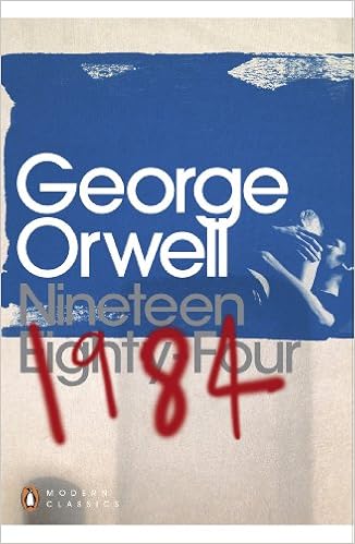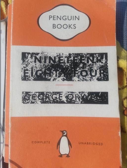


Imagery:


As the main themes of the novel circle government surveillance and public manipulation, I wanted to use snippets of old film of city life, to capture this fuzzy aesthetic to mirror that of 'Big brother'.


Final composition:

Colour:
consistent with the previous covers, like worn out primary colours, to suggest the age and year.
Layout:


Final:
Colour - The choice to use the dark green as the banner was more suited in accentuating the faint greens in the background, to encompass the whole image in a more harmonious way.
Type - Consistent with the penguin book series use of Helvetica for the Crime series, that used the marber grid
Layout - Decided to go with the stretched up version, as the repetitive pattern was too busy and subtracts the depth created by city scape.
Format - Marber grid contained within an A5 portrait cover or A4 landscape spread

No comments:
Post a Comment